
Wall Art for Every Room
A practical room-by-room guide to styles, sizes, and placement
The same print can feel calm in a bedroom and busy in a hallway. Choosing wall art works better when you start with how each room is used, how much light it gets, and how much wall you actually have. This 2026 guide walks through living rooms, bedrooms, kitchens, dining spaces, home offices, and entryways with style ideas you can apply at home.
Every print at wallartK is a giclee on archival 250 gsm fine art matte paper (acid free, FSC). Frames come in natural, dark, or white wood at 26 mm and arrive ready to hang. We print on demand in the USA, UK, Europe, and Australia, with free worldwide tracked shipping and a 14-day quality guarantee.
Match Art to How the Room Works
Before you pick a subject, note three practical details: the main seating or walking line, the largest uninterrupted wall, and the dominant colors already in the room. Art should support those, not fight them.
Busy rooms (kitchens, hallways) usually need cleaner compositions or a small set of related prints. Quieter rooms (bedrooms, reading corners) can carry softer palettes and larger single pieces. For scale rules that apply in every space, see our wall art size guide.

Living Room Wall Art
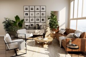
The living room is where scale matters most. Above a sofa, aim for art that spans roughly two-thirds of the furniture width. One large piece keeps the wall calm; a balanced pair or a tight trio works when you want more rhythm without a full gallery.
Abstract geometry and bold color fields read clearly from across the room. A cool-tone Bauhaus circle print such as our Bauhaus cool-tone circle composition pairs well with modern sofas and low media units. Softer botanical options from the floral collection warm up linen and wood-heavy rooms.

Bedroom Wall Art
Bedrooms reward quieter subjects and matte finishes that do not glare under bedside lamps. Center art above the headboard with the bottom edge about 15 to 20 cm above the frame, or hang a horizontal pair if the bed is wide.
Botanicals and gentle abstracts keep the mood restful. A willow-pattern Morris print such as vintage William Morris willow sits comfortably with soft textiles. Avoid high-contrast poster energy right above the pillow line if you want the room to feel slower at night.
Kitchen Wall Art
Kitchens ask for pieces that survive visual noise: cabinets, appliances, and open shelves already compete for attention. Still life studies, clean botanicals, and modest abstracts work better than dense narrative scenes.
Hang art away from steam and direct stovetop splash when possible. A compact still life like Still Life with Jug (1920) suits a dining nook wall or the end of a run of cabinets. Browse more food-adjacent themes in the still life category.
For layouts specific to galley and open-plan kitchens, read the kitchen wall art style guide.

Dining Room Wall Art
Dining rooms are conversation spaces. Art should stay readable when people are seated, so keep the center of the work near eye level from a chair, not from a standing hallway view.
Colorful modern florals and cubist still lifes bring energy without needing a gallery wall. Paul Klee’s Rose Garden (1926) adds patterned color that pairs with wood tables and simple ceramics. If you prefer a set, keep frames identical so the table remains the quiet center.
When art hangs above a sideboard, leave a hand-width of space between the furniture top and the frame. That gap stops the wall from feeling stacked and makes dusting easier.
Home Office Wall Art
Office walls work best when they support focus. Geometry, limited palettes, and clear structure help more than busy narrative scenes behind a screen.
Explore the Bauhaus collection for grid and circle compositions, or choose a landscape with a calm horizon and limited detail. A single medium print behind the desk is usually enough; save denser arrangements for a side wall you face less often.

Hallway and Entryway Art
Hallways are for movement. Vertical formats and narrow series fit better than one oversized landscape that people walk past too quickly to enjoy. Keep frames consistent so the corridor feels intentional.
A brighter abstract or color study can mark the entry without blocking traffic. Kandinsky’s Watercolor with Forest and Rainbow (1913) brings light into a dim corridor. For longer walls, a gallery wall with even spacing works if you plan the grid on the floor first.

Frames, Paper, and Hanging Height
Matte paper reduces glare under overhead lights, which helps in kitchens and offices. Natural wood frames soften pale walls; dark wood frames sharpen contrast against white plaster; white wood frames nearly disappear on light walls when you want the artwork to lead.
Hang most single pieces so the center sits about 145 to 150 cm from the floor. Above furniture, measure from the furniture top instead of the floor. Step-by-step hardware notes are linked in the related guides below.
If you want one browsing path for mixed styles, start with the abstract collection, then branch into floral, landscape, or still life once the room’s mood is clear.
Find prints sized for living rooms, bedrooms, kitchens, and quiet corners.
Related guides: How to hang wall art · Gallery wall complete guide · Office wall art ideas