
A gallery wall can go wrong in two opposite ways. It can feel too matched, as if every print came from the same set. Or it can feel busy, with every piece asking for attention at once.
A collected modernist gallery wall sits in the softer middle. It feels personal and relaxed, but still intentional. The secret is to repeat a few visual anchors while mixing subjects: abstract color, expressive figures, quiet botanicals, and one piece with a little surprise.
Use the ideas below as a starting point, then adjust them to the room you actually live in. Modernist prints look best when they have a bit of breathing room and when the mix feels chosen, not copied.
What makes a gallery wall feel collected?
A collected gallery wall does not need perfect symmetry. In fact, a slightly looser arrangement often feels warmer. The pieces should share something, but not everything.
Choose one or two anchors before you start: a color family, a frame finish, a mood, or a type of linework. Then let the subjects vary. An abstract print can sit beside a figure drawing. A floral print can calm down a bright color field. An animal print can add energy without taking over the whole wall.
If the art is very colorful, keep the frames simple. Natural wood, white, black, or slim brass frames can all work. The point is not to make every piece identical. The point is to give the eye a few places to rest.
Start with one color anchor
Begin with the print that sets the temperature of the room. A warm, colorful piece such as the Matisse La Gerbe print can act as the hero. Its bold shapes give you a palette to repeat elsewhere: yellow, green, blue, orange, and soft neutrals.

Once you have that anchor, look for a second print that speaks the same color language without copying it. The Henri Matisse The Snail print brings playful geometry and a slightly different rhythm. Together, the two prints can make a wall feel bright and expressive without needing every piece to be abstract.
A simple rule helps here: repeat two or three colors across the wall. They do not need to match exactly. A blue in one print can echo a cooler green in another. A warm yellow can appear once as a main color and again as a tiny accent.
Add movement with figure prints
After the color anchor is in place, add a figure print for movement. The Louis Soutter Moving Girls print works well because it has a loose, expressive quality. It brings a human note into a wall that might otherwise lean too heavily on shapes and blocks of color.
Figure prints are useful between strong abstracts. They soften the composition and give the eye a different kind of line to follow. If two colorful prints feel like they are competing, place a figure print between them or slightly below them.
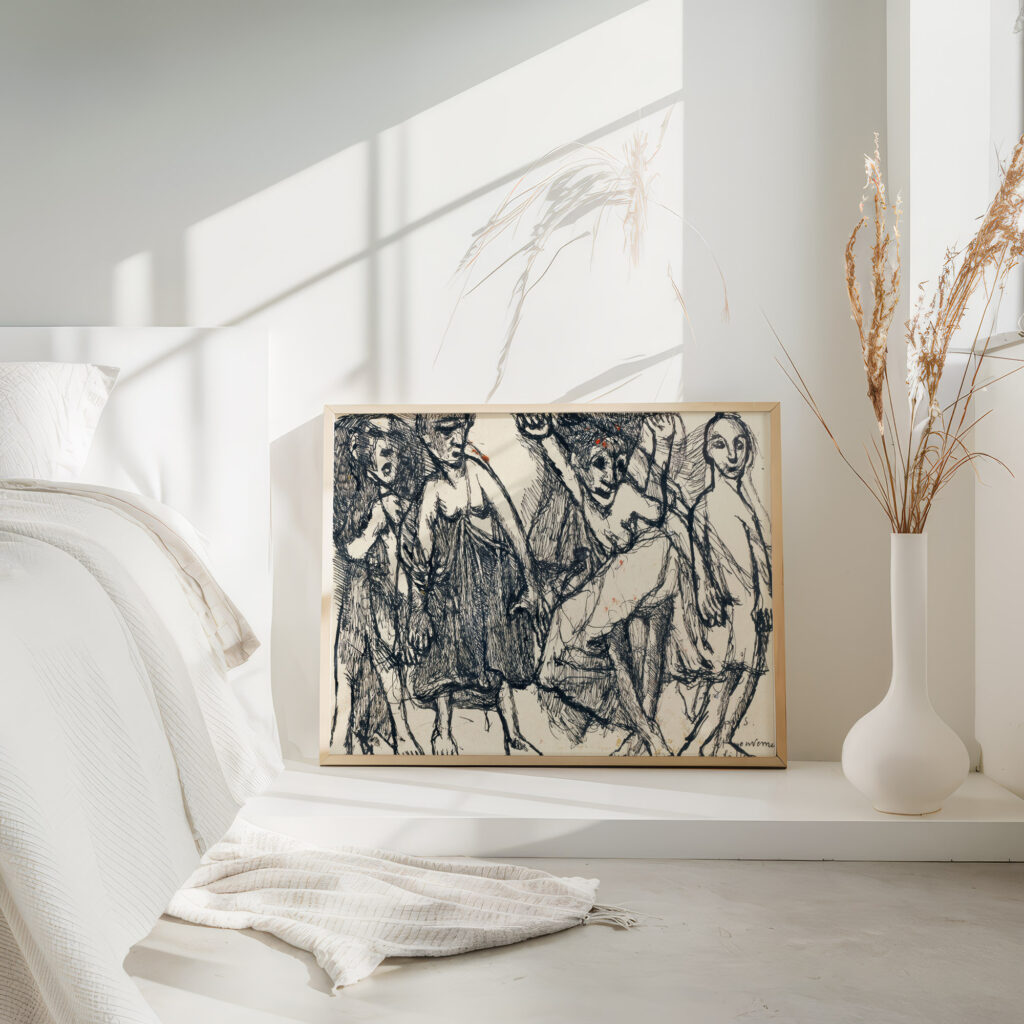
This also helps the wall feel less like a catalog set. A collected wall usually has shifts in mood. One piece may feel bold, another quiet, another a little strange. Those shifts are what make the arrangement feel lived in.
Bring in calm with floral and botanical prints
Modernist color can be joyful, but too much of it can make a wall feel restless. A botanical print gives the arrangement a calmer note. The Julie de Graag Chestnut Leaf print is a good counterpoint because its shape and linework feel grounded.
If you want something softer, try the Julie de Graag Flower print. Florals and botanical pieces often work best as side pieces, lower-row balance, or quiet breaks between brighter prints.
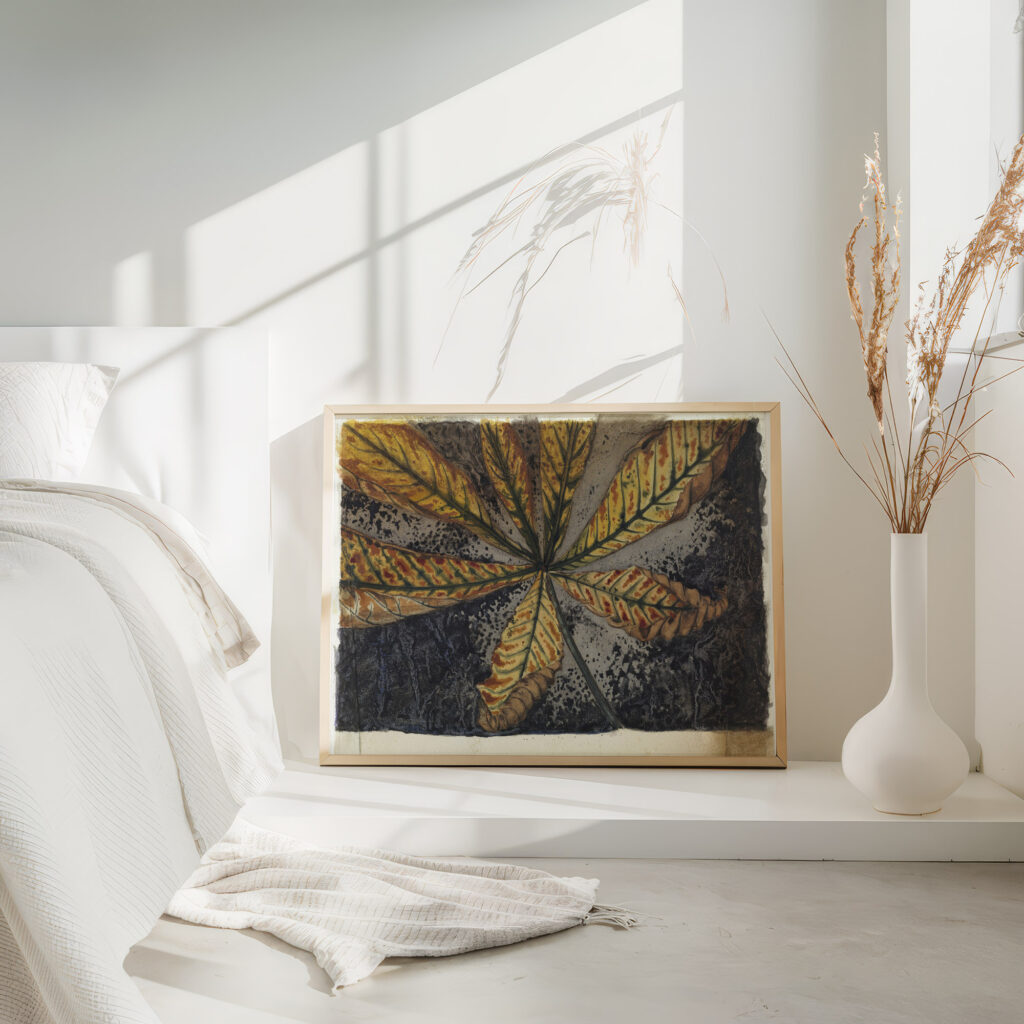
They are also useful in rooms where you want color, but not too much visual noise. A bedroom, reading corner, or narrow hallway can handle a modernist mix when one or two pieces have simpler lines.
Add one unexpected animal or symbolic print
A collected wall should have at least one piece that feels a little unexpected. The Franz Marc Animal Legend print can play that role. It adds a bolder animal subject while still fitting the modernist mood.
Keep it as one featured piece rather than adding several competing focal points. If every print is the loudest print on the wall, the arrangement loses its shape. One conversation piece is enough.
Place the animal print where it can hold weight: near the center, at one end of a horizontal arrangement, or slightly above a quieter botanical print. That gives the wall a sense of movement without making it feel random.

Suggested collected-modernist combinations
Use these combinations as loose recipes, not fixed sets. Swap sizes and frame finishes based on your room.
- Warm colorful living room: La Gerbe, The Snail, Moving Girls, and Chestnut Leaf.
- Eclectic hallway: The Snail, a Julie de Graag botanical print, and Animal Legend.
- Softer bedroom: La Gerbe, Flower 1920, and one Louis Soutter figure print.
- Bold maximalist corner: The Snail, Animal Legend, Moving Girls, and one geometric piece from Abstract Wall Art.
For a narrow wall or apartment entry, three prints may be enough. For a sofa wall, start with four or five and build around one larger hero piece.
Layout tips before you hang
Mock the arrangement on the floor before you put anything on the wall. This lets you see whether the colors are evenly spread or whether one side feels too heavy.
- Start with 2 to 3 inches between frames, then adjust for the size of the wall.
- Use one hero print, two medium anchors, and smaller supporting pieces.
- Keep frames consistent if the art styles vary a lot.
- Repeat a color or shape near the top, middle, and bottom so the wall feels balanced.
- Step back often. A gallery wall is easier to judge from across the room than up close.
If you are unsure, make the spacing slightly more generous. Breathing room makes colorful modernist prints feel intentional rather than crowded.
Shop the look
Build your own modernist mix from the prints in this guide. WallartK prints are giclee on archival 250 gsm fine art matte paper (acid free, FSC), with optional natural, dark, or white wood frames (26 mm, ready to hang), free worldwide tracked shipping, and a 14-day quality guarantee.
- Henri Matisse Print La Gerbe 1953 Flower Print
- Henri Matisse Print The Snail 1953
- Moving Girls – Louis Soutter
- Chestnut Leaf (1887) – Julie de Graag
- Flower (1920) – Julie de Graag
- Animal Legend (1913) – Franz Marc
You can also browse wider collections in Floral Wall Art, Portrait Wall Art, and Animals Wall Art if you want to keep the same mood while changing the subject mix. For more layout help, see the gallery wall ideas guide and the complete gallery wall guide. If Matisse color is your starting point, read how to style Matisse cut-out prints. When you are ready to hang, use the how to hang wall art guide.
FAQ
What is a collected gallery wall?
A collected gallery wall is an arrangement that feels gathered over time rather than bought as a matching set. The prints can vary by subject and style, but they usually share a few anchors, such as color, frame finish, scale, or mood.
Can you mix abstract and floral prints in one gallery wall?
Yes. Abstract prints bring color and movement, while floral or botanical prints can add calm. Keep one repeated color or frame finish so the mix feels deliberate.
What colors work well with modernist wall art?
Modernist wall art often works well with warm neutrals, soft whites, natural wood, deep blue, olive green, mustard, terracotta, and black accents. The best palette depends on the main print you choose first.
How many prints should a gallery wall have?
Three prints can work for a small wall. Four to six prints usually feel right above a sofa, bed, console, or hallway bench. Larger walls can hold more, but the arrangement should still have one clear hero piece.
Should all gallery wall frames match?
They do not have to match, but they should relate. If the prints are colorful and varied, matching frames can make the wall feel calmer. If the artwork is quieter, mixed frames can add character.