
Circle Prints for Modern Rooms
From Kandinsky’s night-sky circles to Taeuber-Arp’s exacting geometry: a practical guide to choosing and placing round forms.
A circle can soften a rigid room. Against square windows, rectangular sofas and straight shelves, it brings a different rhythm. The trick is choosing the right kind of circle: floating and atmospheric, repeated in a grid, or held in tension with rectangles. This guide compares four actual works available as WallArtK prints, then turns the art history into usable advice for a living room, bedroom or work space. For one print or a grouping, start with the wall.
Why modern artists kept returning to the circle
Geometric abstraction gave early twentieth-century artists a way to build pictures from color, line and shape rather than a recognizable landscape or person. It did not produce a single look. Kandinsky used circles to create a sense of depth and movement; Sophie Taeuber-Arp set them against straight-edged shapes; László Moholy-Nagy worked with precise geometry and the language of modern design. They are connected by form, but their compositions behave differently in a room. A quiet black-ground circle print reads differently from a bright grid even if both are labeled “abstract wall art.”
Kandinsky: one shape, two very different moods
Wassily Kandinsky joined the Bauhaus faculty in Weimar in 1922 and moved with the school to Dessau in 1925. The Guggenheim identifies Several Circles as a January–February 1926 oil painting. Its colored discs vary in scale, overlap and appear to float across a dark ground. That dark surround is important for decorating: it lets the colors register without asking every other object in the room to be equally bright. Several Circles (1926) by Wassily Kandinsky works as the focal point above a pale console, or opposite a window where the wall needs visual weight.

Now compare Squares with Concentric Circles (1913) by Wassily Kandinsky. This 1913 study organizes concentric circles inside squares. Instead of one deep field, the repeated compartments create a lively, almost tile-like rhythm. A room with solid upholstery, plain cabinets or restrained bedding can absorb that variation; a room already filled with patterned curtains and rugs may need the quieter Several Circles. Do not assume “Kandinsky circles” names one palette. Look at the actual print and decide whether you want a single dark anchor or many small color conversations.
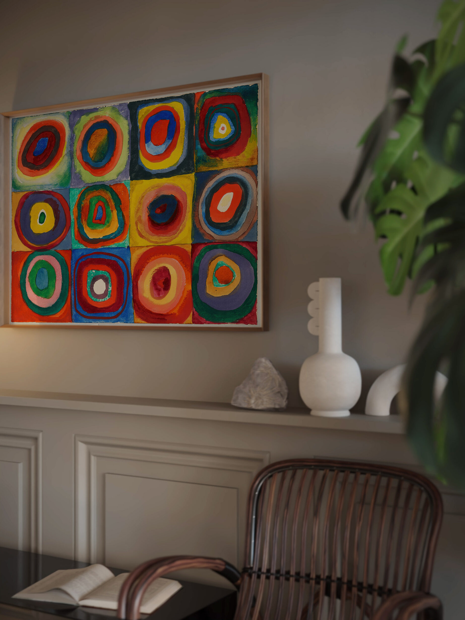
The Bauhaus context matters, but it is not a license to call every circle picture Bauhaus. Kandinsky’s 1913 square-and-circle study predates his appointment there, while Several Circles belongs to his Bauhaus years. The shared idea is deliberate experimentation with color and form. If you want more of the school’s wider design vocabulary, see our guide to choosing Bauhaus prints.
Taeuber-Arp: geometry with a softer pace
Sophie Taeuber-Arp worked across painting, textiles, performance and interiors, refusing the split between fine art and design. MoMA’s 1981 catalogue records her association with the Cercle et Carré group in 1930 and describes the circles and rectangles she developed on monochrome grounds around that time. In Composition with Rectangles and Circles on Black Ground (1931) by Sophie Taeuber-Arp, the black ground and measured mix of curves and straight edges give the eye places to pause. It is a strong option when a room has warm wood, a simple lamp and a few carefully chosen objects rather than a full gallery wall.
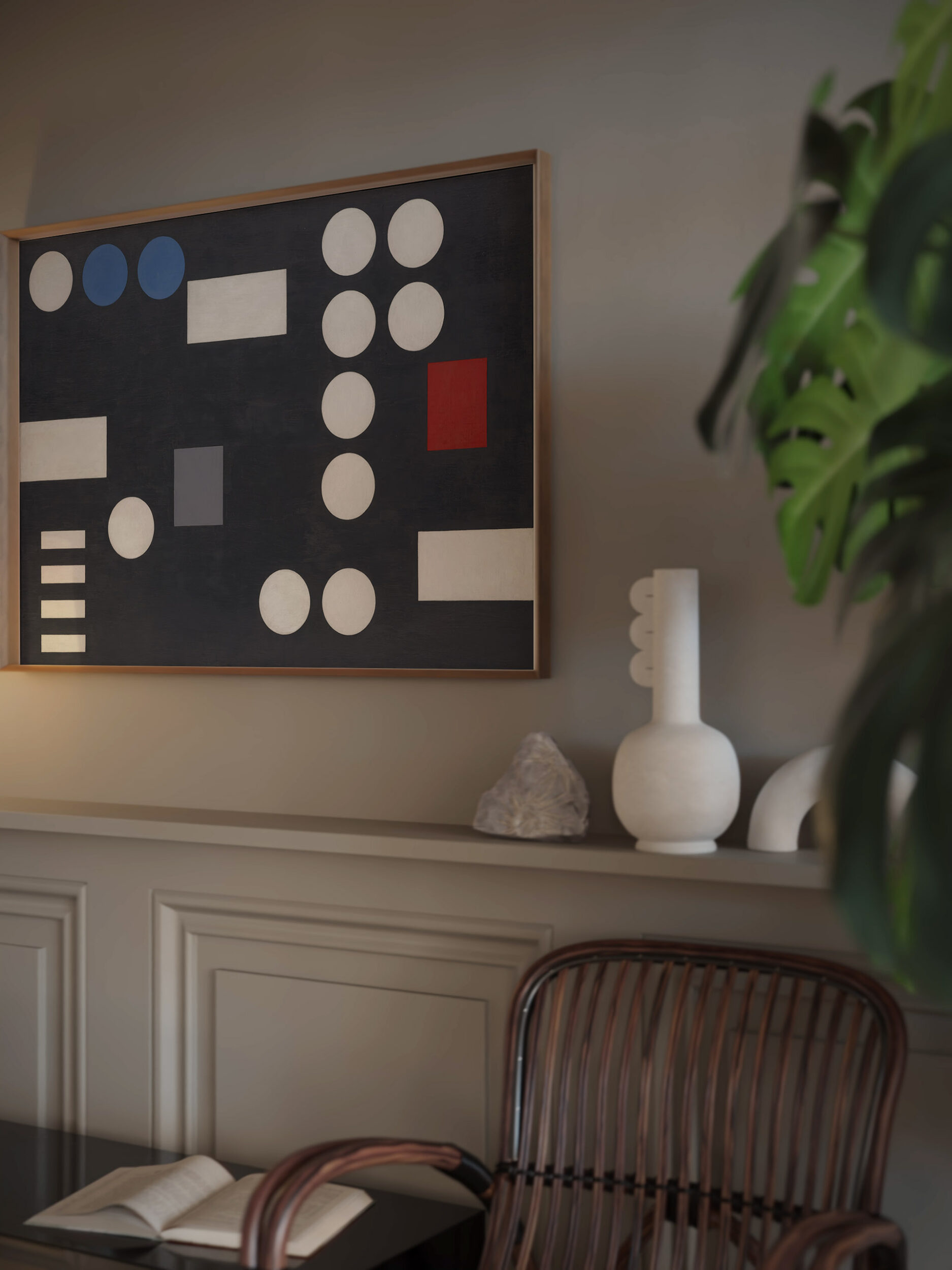
Try placing a Taeuber-Arp print near furniture with obvious linear structure: a slatted sideboard, a rectangular desk or a bookcase. The curves interrupt those lines while the rectangles keep the pairing coherent. Avoid forcing exact color matches with cushions. Pick one recurring tone from the work and let the remaining furnishings be more neutral. This is a styling choice, not a historical rule: the print should still look good if you swap out a throw pillow next season.
Moholy-Nagy: repeat the shape, change the tempo
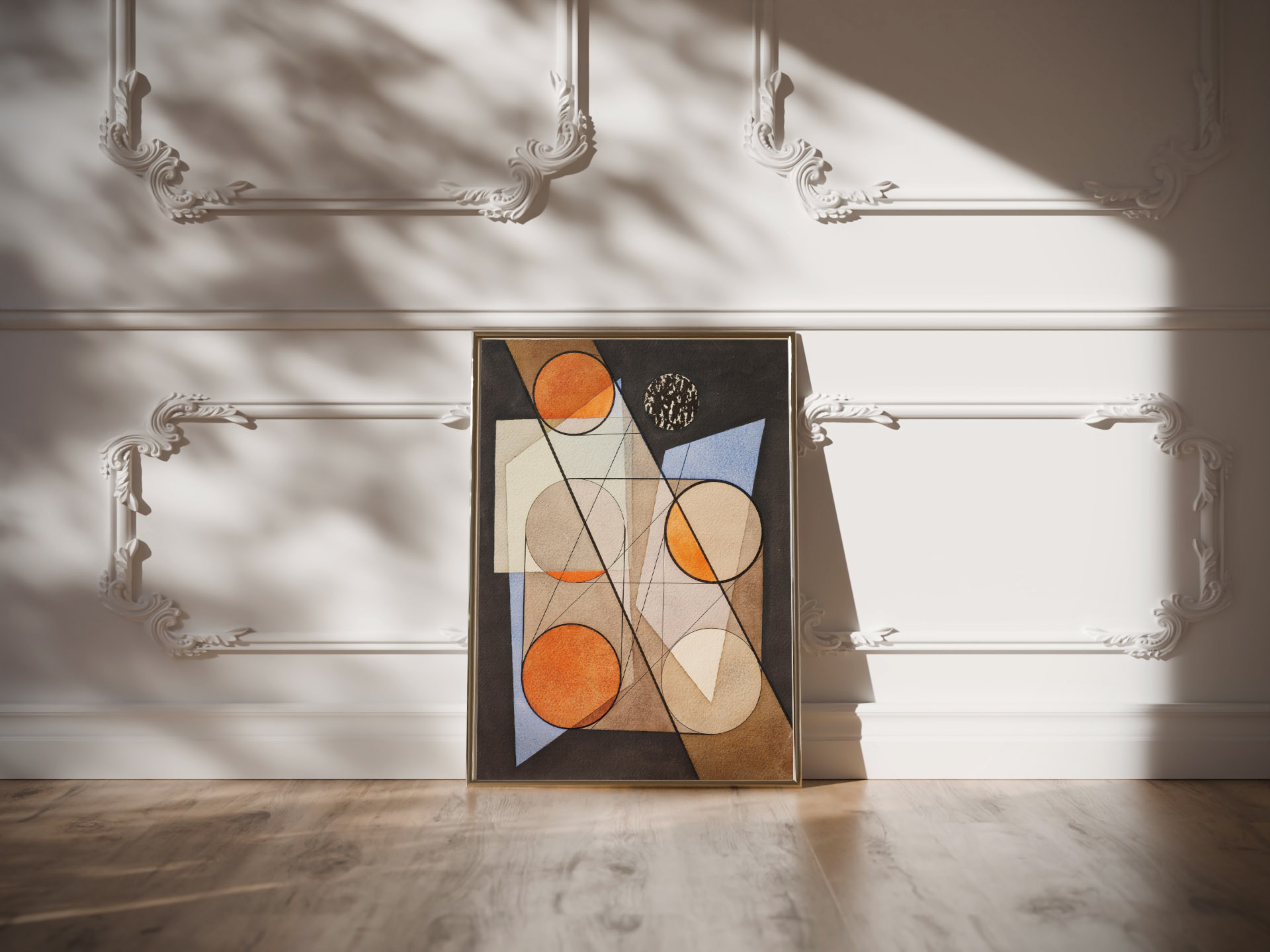
For a more measured arrangement, consider Composition with Symmetrical Circles (1932) by László Moholy-Nagy. The WallArtK listing dates the work to 1932. Moholy-Nagy taught at the Bauhaus, whose teachers worked across art, design and visual experiment; the Metropolitan Museum’s account of geometric abstraction places him among its art faculty. This print is useful when you want circular forms without the lively color-grid effect of Kandinsky’s 1913 study. Its repeated shapes speak to architectural details such as round mirrors, globe lamps or circular tables, but one such echo is plenty. Too many matching circles turn a room into a theme.
Choose a size by the wall, not by the thumbnail
Measure the width of the furniture beneath the proposed print. As a starting visual test, aim for artwork or a grouped arrangement occupying about two-thirds to three-quarters of that width. For a 72 in (183 cm) sofa, that suggests a grouping roughly 48–54 in (122–137 cm) wide. This is a design heuristic, not a product-size promise: frame dimensions, furniture shape and surrounding space will change the result. Tape a paper rectangle on the wall and view it from your usual seat before ordering.
On a small side wall, a 12 × 12 in (about 30 × 30 cm) square print can feel deliberate with breathing room on every side. On a larger, uninterrupted wall, a 28 × 28 in (about 70 × 70 cm) square format can hold its own; check the particular product’s available options before choosing. If you arrange two square prints, leave about 2–4 in (5–10 cm) between their outer frames and judge the pair as one composition. A dark frame increases perceived visual weight even when the image size stays the same. Our wall art size guide goes deeper on scale.
Hang it where the composition can breathe
For a standing-view wall, start with the print’s visual center near 57–60 in (145–152 cm) from the floor, then adjust for the actual sight line. Over a sofa or sideboard, try the bottom edge around 6–10 in (15–25 cm) above the furniture; a high-backed sofa or tall lamp may call for more space. The dimensions refer to the framed piece, not only the image. Make sure the print will not be knocked by a door, and check that the wall fixing suits your wall material and the finished weight. Our hanging guide covers layout and spacing in more detail.
For a simple trio, use one dominant print and two quieter companions. Put Several Circles beside a less saturated geometric work rather than another equally loud color grid. To mix periods without losing cohesion, repeat one element—black ground, a circular motif or a frame finish—rather than trying to match every color. See our collected modernist gallery wall ideas for an arrangement framework.
Frames, finish and a quick buying check
On the WallArtK product pages, check the offered size and format for the specific piece. WallArtK describes its prints as giclée on 250 gsm acid-free fine art matte paper; framed options use natural, dark, white or black wood, with shatterproof plexiglass and hanging hardware included. A black frame can tie together Several Circles and Taeuber-Arp’s black ground; natural wood can soften a graphic composition against a white wall. Choose the frame for the room and for the image’s contrast, not because the artist once worked at a design school.
Explore more works in WallArtK’s abstract wall art category. If the language of nonrepresentational work is new to you, the abstract art for beginners guide helps you decide what to look for before browsing prints.
Frequently asked questions
Which circle print suits a small living room?
If the room is already full of color, try a single dark-ground print such as Several Circles or Taeuber-Arp’s 1931 composition, with open wall around it. A smaller room does not automatically require tiny art; test a paper template against the furniture, then decide whether one stronger piece feels calmer than several small ones.
Can Kandinsky’s squares and circles go in a bedroom?
Yes, but notice its active grid. Hang it on a wall you enjoy seeing when you enter rather than assuming it must sit above the bed. Keep bedding comparatively plain if you want the print to lead, or choose a darker and quieter work if your room already has strong pattern.
Do all four prints need identical frames for a gallery wall?
No. Consistent spacing and a shared visual thread often matter more than identical frames. For a neat row, matching frame finishes help. For a collected look, mix one dark and one natural finish while retaining an even gap—roughly 2–4 in (5–10 cm)—between pieces.
Is the 1913 Kandinsky work a Bauhaus painting?
No: the work is dated 1913, and Kandinsky began teaching at the Bauhaus in 1922. It belongs in a conversation about his experiments with color and circles, but the dates should not be collapsed. Several Circles, dated 1926, does fall in his Bauhaus period.
The simplest choice: pick the print whose rhythm suits the room first, then confirm the available dimensions and frame options on its product page. The circle may be simple; the space around it is what makes it feel intentional.