
Mondrian & De Stijl Prints
How to style red, yellow and blue grid art so a modern room feels calm, balanced and intentional.
A Mondrian print is one of the rare pieces of wall art people recognize from across the room: black lines, white planes, and a few blocks of red, yellow and blue. That recognizability is also the risk. Hung carelessly, it reads as a poster cliché. Hung with the same discipline the painting has, it makes a room look edited and architectural.
This guide explains where the style came from, how Piet Mondrian and Theo van Doesburg differ, and how to choose the size, frame and placement that suit your room. All the prints mentioned are in our abstract wall art collection.
What De Stijl actually was
De Stijl (“The Style”) was a Dutch movement founded in 1917, when the painter, writer and organizer Theo van Doesburg launched a magazine of the same name in Leiden. Around it gathered painters such as Piet Mondrian, Bart van der Leck and Vilmos Huszár, and architects and designers including J.J.P. Oud and Gerrit Rietveld, whose Red and Blue Chair became the movement’s best-known object.
The idea was radical for its time: strip art down to its most basic elements, straight horizontal and vertical lines, the three primary colors, and the “non-colors” white, gray and black, and use them to express a universal harmony rather than a picture of something. The Netherlands stayed neutral during the First World War, which gave this small group room to work while much of Europe was at war.
Mondrian called his version of the idea Neo-Plasticism and set it out in a 1920 essay published in Paris, Le Néo-Plasticisme. The same visual language spread into furniture, interiors, typography and architecture, which is why these paintings still look at home in modern rooms a century later. They were designed with rooms in mind.

Composition with Red, Yellow and Blue (1927), Piet Mondrian, shown in the four frame finishes.
Piet Mondrian: from landscapes to the grid
Mondrian (1872–1944) was born in Amersfoort and trained as a landscape painter in the Dutch tradition. His early work shows windmills, dunes and trees, and his catalog includes the pointillist Apple Tree (1908–1909), painted when he was experimenting with dots of pure color.
After seeing Cubist work by Picasso and Braque, he moved to Paris in 1912. Over the next few years his trees and facades broke apart into short lines and planes. He was back in the Netherlands when war broke out in 1914, and it was there that he met van Doesburg and joined De Stijl. By the early 1920s he had arrived at the format he is famous for: an asymmetrical grid of black lines with a few rectangles of primary color, carefully weighted against large white areas.
Composition with Red, Yellow and Blue (1927) is a classic example. The color is pushed to the edges, the white center does most of the work, and nothing is symmetrical, yet the whole thing feels perfectly still. Composition with Blue, Red, Yellow and Black (1922) is denser and graphically heavier, a good choice when the wall needs more presence.
Mondrian also painted “lozenges”: square canvases turned 45 degrees so they hang on a point. The lines are cut off by the diagonal edges, which makes the composition feel as if it continues beyond the frame. Our Lozenge Composition with Yellow, Black, Blue, Red and Gray (1921) reproduces that diamond within a square print, so it hangs normally while keeping the tilted look.
He left Paris in 1938, spent two years in London, and moved to New York in 1940, where the city’s grid and jazz inspired his last finished painting, Broadway Boogie Woogie (1942–43). He died in New York in 1944.

Lozenge Composition (1921): Mondrian’s diamond format, printed on a square sheet.
Theo van Doesburg: the diagonal rebel
Theo van Doesburg (1883–1931), born in Utrecht, was De Stijl’s engine: editor, lecturer, painter, typographer and architect. He spent time in Weimar in 1921–22, where his informal De Stijl course influenced students at the Bauhaus, and in 1925 the Bauhaus published his book Principles of Neo-Plastic Art as Bauhaus Book No. 6. We print its cover design (1925).
In the mid-1920s van Doesburg started tilting his grids by 45 degrees to add movement, an approach he called Elementarism. Mondrian, who held to strict horizontals and verticals, broke with De Stijl soon afterwards. Van Doesburg’s Counter-Composition (1927–28) and the earlier Composition in Gray (Rag-time) (1919) show how differently the two men used the same vocabulary. He died in Davos, Switzerland, in 1931, and the magazine De Stijl ended with him.
For a room, the difference is useful. Mondrian is calm and static. Van Doesburg is more energetic, more graphic, and often uses softer grays and greens alongside the primaries.

Counter-Composition (1927–28), Theo van Doesburg, in a white frame.
Which room suits which print
- Living room: one large Mondrian centered over the sofa. The white planes keep it light, so it can be big without overwhelming the space.
- Home office: a grid feels orderly and focused. Choose a composition with more white and only one or two color blocks.
- Kitchen or dining area: red and yellow work well near wood, white tiles and black hardware. A pair of square prints over a sideboard looks deliberate.
- Bedroom: pick the quieter, gray-toned van Doesburg compositions, or a Mondrian with large white areas, rather than the most saturated works.
- Hallway or stair: vertical van Doesburg prints suit narrow walls and draw the eye along a passage.
- Kids’ rooms and playrooms: primary colors are cheerful without being childish, so the print grows with the room.
Size: square vs. vertical formats
Most of our Mondrian compositions come as square prints: 12×12 in (30×30 cm), 20×20 in (50×50 cm) and 28×28 in (70×70 cm). The van Doesburg compositions shown here are vertical, ranging from 5×7 in (13×18 cm) to 30×40 in (75×100 cm). Check each product page for the exact sizes.
- Above a sofa: aim for art about two-thirds of the sofa’s width. For a 84 in (213 cm) sofa, a single 28×28 in (70×70 cm) square is the minimum. Two 28×28 in prints side by side with a 3 in (8 cm) gap fill the space more fully.
- Above a bed or console: a 20×20 in (50×50 cm) pair, or one 24×36 in (60×90 cm) vertical van Doesburg.
- Small walls and shelves: 12×12 in (30×30 cm) squares, grouped in threes, give a crisp grid.
Frames, color and hanging
Every print is a giclée on 250 gsm acid-free fine art matte paper, available unframed or in natural, dark, white or black wood frames with shatterproof plexiglass. Framed prints arrive ready to hang with the hardware included.
- White frame: the purist choice. It extends the white planes and suits white or pale walls.
- Black frame: echoes the black lines and gives the most graphic, gallery-like look.
- Natural wood: warms the primaries. Good with oak floors, Scandinavian or Japandi rooms and mid-century furniture.
- Dark wood: a softer contrast for traditional rooms, where Mondrian plays nicely against moldings and paneling.
Hang the center of a single print or a group at about 57–60 in (145–152 cm) from the floor. Over furniture, leave 8–10 in (20–25 cm) between the furniture top and the bottom of the frame. Because the grid is so precise, a crooked frame shows instantly. Use two hooks or a level, and recheck after a day.
To tie a print into the room, pick up one color only: a red cushion, a yellow vase or a blue throw. Matching all three looks themed. The neutrals in the print (white, light gray, black) are the colors to repeat in larger surfaces.
Pairing De Stijl with other prints
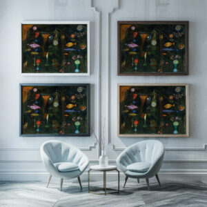
De Stijl prints sit naturally next to Bauhaus geometry, which shares the same history, and next to other early modernists such as Paul Klee. For a softer contrast, pair a single Mondrian with a still life or a botanical print in a similar frame, and let the grid be the one strong graphic in the room. Mondrian’s own Still Life with Gingerpot II (1912) makes a clever pairing, because it shows his move toward abstraction while still being a recognizable object.
Explore Mondrian, van Doesburg and other geometric abstraction, printed on fine art paper and framed ready to hang.
FAQ
What is the difference between Mondrian and De Stijl?
De Stijl was the group and magazine founded by Theo van Doesburg in 1917. Mondrian was its best-known painter, and Neo-Plasticism is the name he gave to his own strict version of its ideas.
What size Mondrian print should I hang over a sofa?
Aim for about two-thirds of the sofa’s width. On most three-seat sofas that means one 28×28 in (70×70 cm) square, or two squares hung side by side with a 2–3 in (5–8 cm) gap.
Which frame suits a Mondrian print best?
White for a pure, airy look; black to echo the painted lines; natural wood to warm the primary colors in Scandinavian or mid-century rooms.
Do Mondrian prints work in a traditional room?
Yes. The clean grid looks striking against moldings, paneling and antiques. A dark or natural wood frame helps the print sit comfortably among older furniture.
Why are some Mondrian paintings diamond-shaped?
They are “lozenge” compositions: square canvases hung on a corner. Mondrian used the format to make the lines feel as if they continue beyond the edges of the painting.