Faces are the first thing most of us read in a room. The human brain has an area, the fusiform face area, that responds to faces more strongly than to almost anything else. That is why a single portrait on a wall can make a quiet room feel inhabited, and why placement and scale matter more for portraits than for any other kind of art.
This guide covers how to choose a portrait style, where portraits work best room by room, and how to build a portrait gallery wall that looks intentional rather than accidental.
Why portraits work differently than other art
Abstract art sets a mood. Landscapes add depth. Portraits add presence. A face on the wall gives the room a second “person”, so even an empty room feels occupied.
That has practical consequences. A direct gaze feels strong and suits a single statement piece. A face turned slightly away feels calmer and is easier to live with in a bedroom or office. And because we read faces so quickly, a portrait that is too small for its wall looks lost faster than an abstract print of the same size.
Four portrait styles and where each works
Matching the style to the room is the decision that matters most. Once you know your direction, browse the portrait wall art collection.
Modernist and abstracted portraits
Early twentieth-century artists broke the face into lines, planes and blocks of color. These portraits suit modern, Scandinavian and mid-century rooms because they read as both art and graphic shape. Otto Freundlich, one of the first painters to work in pure abstraction, is a good example: The Signs (1919–20) turns a figure into interlocking color. His work was later condemned by the Nazis, and one of his sculptures was put on the cover of the 1937 “Degenerate Art” exhibition guide.

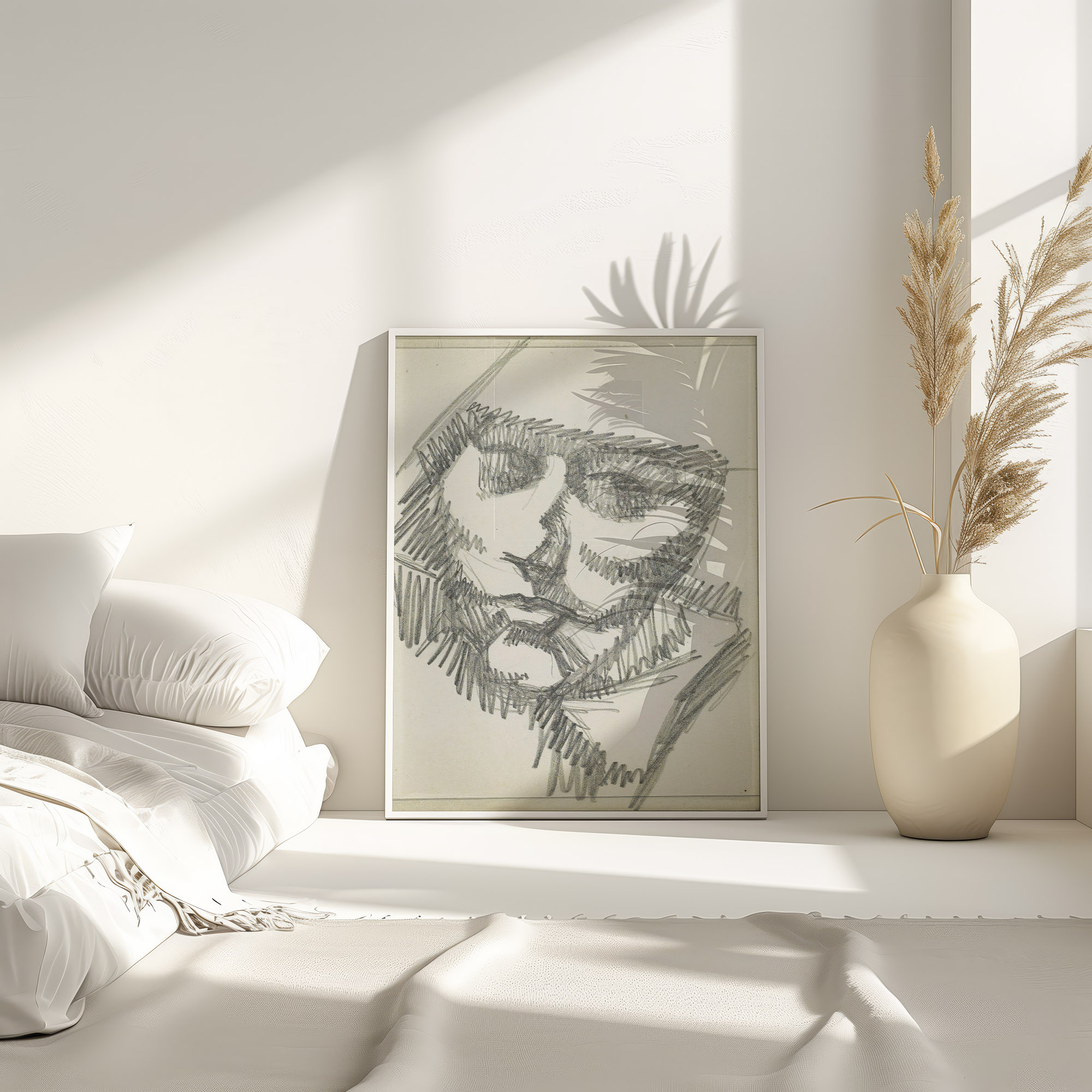
Line drawings and sketches
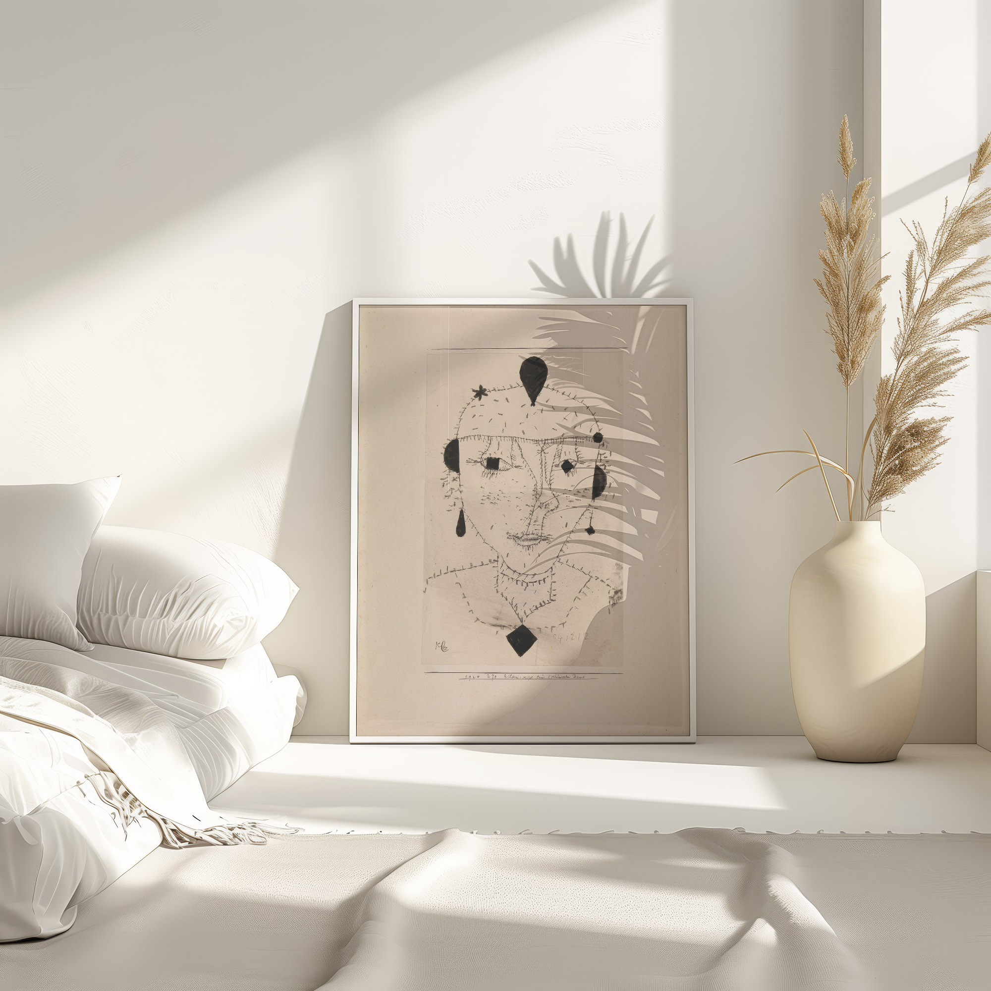
Sketch portraits are the easiest to live with. They are light on the wall, work on white or pale walls, and look good in natural wood frames. Paul Klee, who taught at the Bauhaus for ten years, made many small, playful figure studies; his Portrait Sketch of a Costumed Lady (1924) is a good choice for a bedroom, reading corner or narrow wall.
Geometric and avant-garde figures
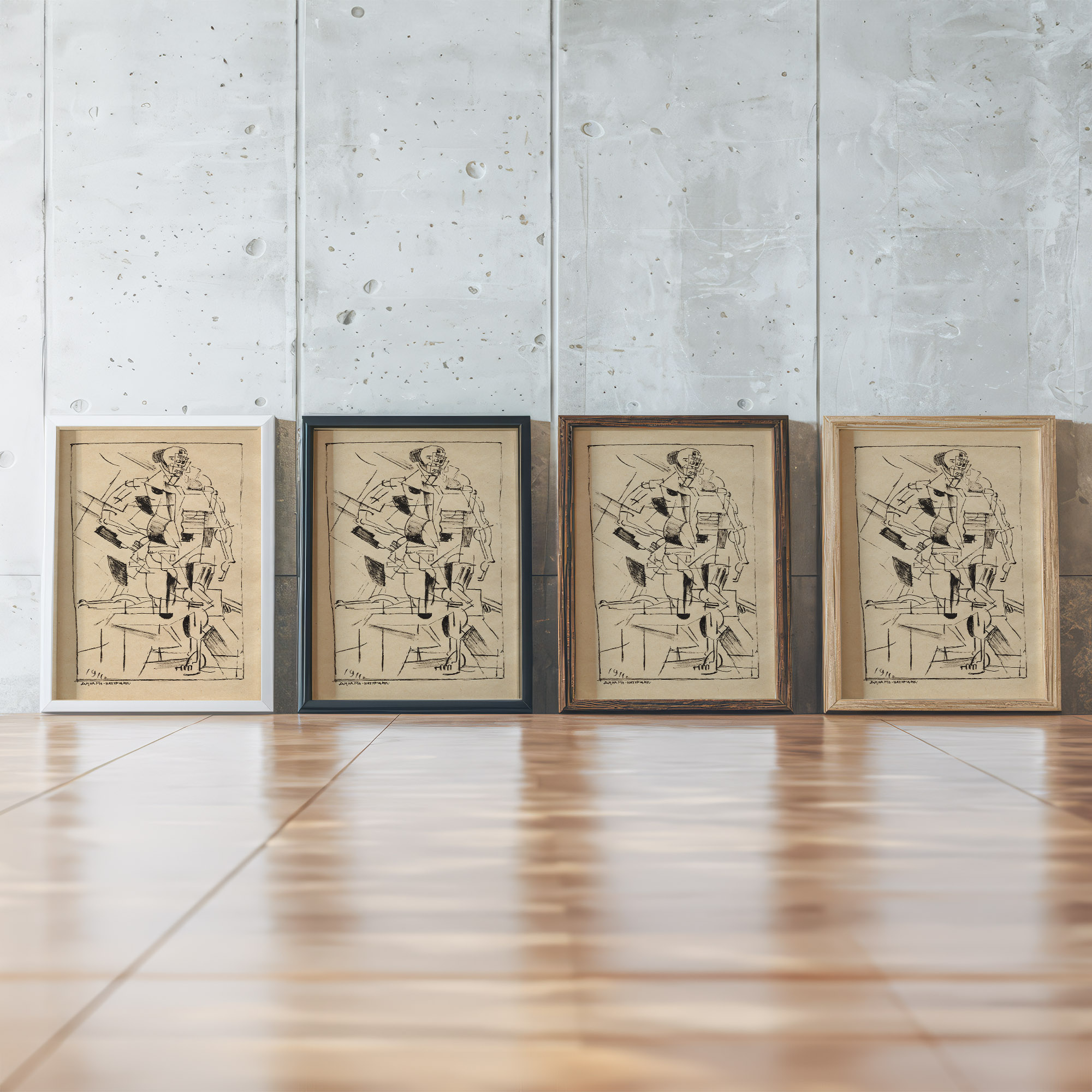
Kazimir Malevich, the Kyiv-born painter behind Black Square (1915), reduced figures to pure form. His Dynamic Model (1919) shows that a simplified figure can still hold a large wall. Scale is the key with this style: go one size larger than your first instinct, because minimal images disappear when printed small.
Quiet realist portraits
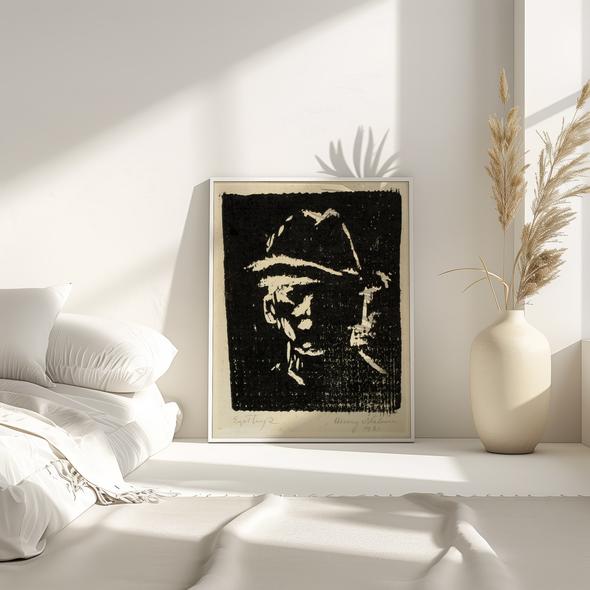
Calm, direct portraits from the interwar years suit studies, bedrooms and dining rooms with warm walls. Try Henry Nielsen’s Man Portrait with Hat (1931) or Alfred Simonsen’s Man Portrait (1926–27). Dark wood frames deepen their tones; black frames make them feel more modern. For stronger line and a more graphic head, Reijer Stolk’s Head (1906) sits between realism and modernism.
Placement by room
Living room
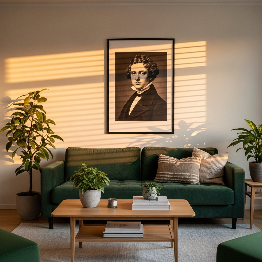
Above the sofa or fireplace is the classic spot. Hang so the center of the artwork is at eye level, about 57 to 60 inches (145 to 152 cm) from the floor, and leave 6 to 12 inches (15 to 30 cm) between the top of the sofa and the bottom of the frame. One piece, or the whole group, should be about two-thirds of the sofa’s width. More on scale is in the large wall art size guide, and practical steps are in how to hang wall art.
Bedroom
Bedroom portraits should create atmosphere, not tension. Choose softer faces, sketches or averted gazes over direct, high-contrast stares; you will see this piece last thing at night. Match the scale to the headboard, since a king bed needs larger art than a single bed. See also bedroom wall art ideas.
Home office
A portrait makes a home office feel less solitary. Pick calm presence over drama, because you will look at it for hours. Hang it where you see it when you look up from the screen, not directly behind you on video calls, unless you want it to be part of your background.
Hallway and entryway
Hallways are underused and ideal for portraits: people walk past them rather than sit in front of them, so bolder faces work. A row of three portraits at the same center height turns a corridor into a small gallery. Mixed sizes are fine, but keep the frame finish consistent so the wall does not feel chaotic.
Building a portrait gallery wall
For a full walkthrough, use the gallery wall complete guide. The short version:
- Lay it out on the floor first. Photograph the arrangement before you hang anything.
- Use paper templates. Trace each frame, tape the paper to the wall and adjust before drilling.
- Start from the center. Hang the largest piece first, then build outward.
- Keep spacing consistent. Leave 2 to 3 inches (5 to 8 cm) between frames throughout.
- Mind the gazes. Faces looking toward the center of the arrangement hold it together; faces looking out of it pull the eye away.
Portraits also mix well with other subjects. For layouts that combine figures with abstracts and botanicals, see the gallery wall ideas guide and collected modernist gallery wall ideas.
Matching or mixing frames
Matching frames look curated. All black reads modern, all natural wood reads warm, all white reads light and gallery-like. If you are unsure, all black is the safest default for portraits.
Mixed frames feel collected over time. Vary them, but keep one shared element: the same finish family, or a similar frame width.
Print and frame quality
WallartK prints are giclée prints on 250 gsm acid-free fine art matte paper, which keeps facial detail readable and avoids glare from windows and lamps. Frames come in natural, dark, white or black wood, with shatterproof plexiglass and hanging hardware included, so they arrive ready to hang. Prints are made to order and fulfilled across 21 countries, with free shipping worldwide and a 14-day window for any damage or quality claim.
Portrait wall art FAQ
How high should I hang portrait wall art?
Center it at about 57 to 60 inches (145 to 152 cm) from the floor. Above furniture, leave 6 to 12 inches (15 to 30 cm) between the furniture and the bottom of the frame.
What size works above a sofa?
About two-thirds of the sofa’s width, for either one piece or the whole group.
Can I mix portrait styles?
Yes, as long as the frames and the color palette stay consistent. Sketches and modernist color portraits mix well in black or natural wood frames.
Does the direction of the gaze matter?
Yes. Faces looking into the room feel warmer. In a gallery wall, faces turned toward the center hold the group together. Direct frontal gazes are strong and work best as single statement pieces.
Pick a style that suits the room, size up more than your instinct suggests, and if you want the lowest-risk start, choose one strong portrait in a simple black or natural wood frame.