Henri Matisse Prints
Henri Matisse prints are a natural fit for rooms that need more color, movement, and personality. His cut-out language — bold shapes, confident color blocks, flowers, leaves, swimmers, and sea forms — feels playful without becoming childish, modern without feeling cold.
The key is to treat colorful cut-out wall art as part of the room’s palette, not as an afterthought. A Matisse print can become the focal point above a sofa, a bright connector inside a gallery wall, or a calm blue accent in a bedroom or home office. This guide shows how to choose the right role for the print before you choose the wall.
Start with the color role
Before comparing sizes or frames, decide what the artwork should do for the room. Colorful Matisse prints usually work in one of three roles: focal point, accent, or connector.
Use a focal point when the room feels too quiet
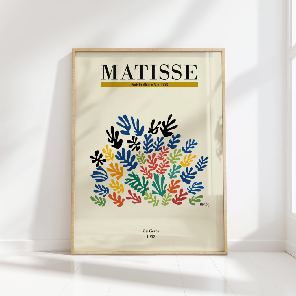
If the room is mostly neutral — white walls, beige sofa, pale rug, natural wood — one strong print can carry the space. A piece like the Henri Matisse La Gerbe print works well here because the flower-like cut-outs bring several colors into one compact composition. Let it sit above the sofa, console, bed, or reading chair, then repeat one or two colors in cushions, books, ceramics, or a throw.
Use an accent when the room already has color
In a room that already uses blue, red, yellow, or green, choose a print that supports the palette instead of competing with it. The Matisse Icarus print can act as a blue modernist accent, especially in spaces with navy textiles, black frames, or crisp white walls.
Use a connector in a gallery wall
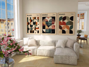
A gallery wall needs a few pieces that visually hold the arrangement together. Cut-out prints are useful because their shapes are simple and their color blocks are clear from a distance. A Matisse cut-outs print can connect photography, line drawings, and typography when the frames share a consistent finish.
Match the print to the room
Living room: choose energy with control
The living room is usually the safest place for the brightest Matisse print. Above a sofa or sideboard, choose one confident piece and give it breathing room. If the room has many small objects already, keep the wall arrangement simple: one print centered above furniture often feels more polished than a crowded cluster.
For a bolder focal wall, the Matisse The Snail print brings a strong colorful abstract presence. It works especially well when the surrounding furniture is simple, because the artwork provides the movement.
Bedroom: let blue and white calm the palette
Bedrooms can still use colorful modern art, but the colors should feel restful when you see them at night and in the morning. Blue-led Matisse prints are useful here because they keep the cut-out look while softening the mood.
Try a blue accent print above a dresser, beside a reading corner, or as one half of a balanced pair. Keep bedding simple and repeat the blue in one small detail rather than matching everything exactly.
Hallway or entry: make the first wall memorable
A hallway can handle more personality than people expect. Because you pass through it quickly, a colorful print creates a strong first impression without overwhelming the rooms where you spend more time. A vertical cut-out print can lift a narrow wall; a horizontal blue composition can make a corridor feel more open.
Home office: add creativity without clutter
For a desk area, choose a print that feels energizing but not visually noisy. Clean shapes and limited color blocks are easier to live with during long work sessions. Hang the print where it can be seen from the desk, but avoid placing a very busy composition directly behind the monitor.
Use organic shapes for coastal and relaxed interiors
Not every Matisse-inspired room needs bright primary color. Some cut-out prints feel softer because their shapes suggest leaves, seaweed, coral, or water. That makes them useful in coastal, Mediterranean, and relaxed modern interiors.
The Matisse sea creatures print is a good direction for rooms with sandy neutrals, pale woods, linen textures, and blue-green accents. The Matisse Seaweed print can do similar work when you want organic shapes rather than a floral or geometric feeling.
Keep the surrounding decor tactile and simple: woven baskets, ceramic lamps, natural wood, cotton or linen textiles. The artwork supplies the color, while the materials keep the room grounded.
Think about scale before details
A common mistake is choosing a print that is too small for the wall. As a general rule, artwork above furniture should feel connected to the piece below it. Above a sofa, sideboard, or bed, the art area often looks best when it is roughly two-thirds the width of the furniture. On a narrow wall, a single vertical print can feel more intentional than several small pieces.
If you are unsure, measure the wall and mark the approximate art size with painter’s tape before ordering. This simple step prevents the print from looking lost once it is hung.
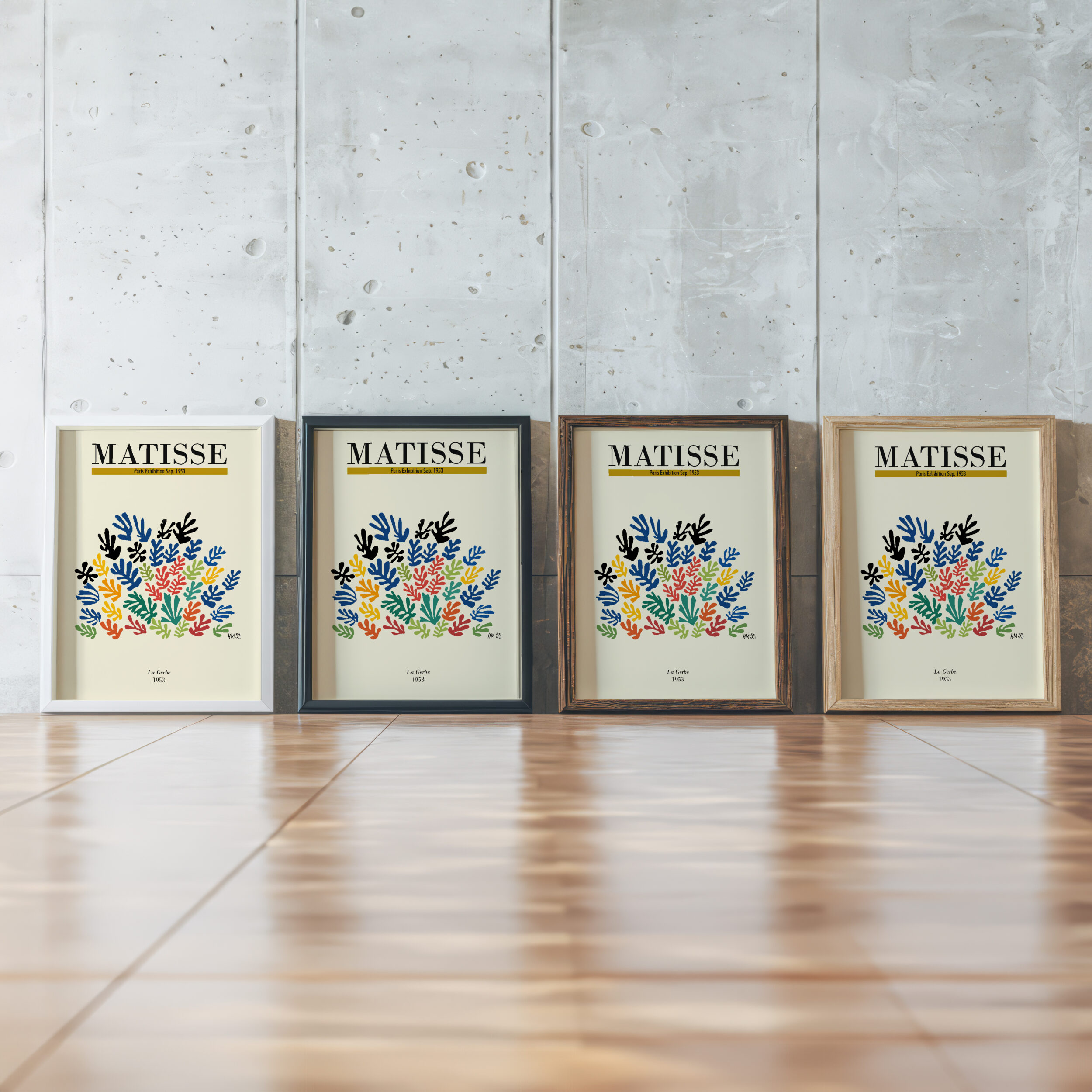
Because product options can change, check the current size and finish choices on the individual product page before deciding. If you plan to frame several prints together, choose a consistent frame color first; the art can vary more when the frames are unified.
Compare colorful abstract, blue, flower, and cut-out prints
If you like the Matisse look but are not sure which direction fits your room, use the subject and palette as your filter.
- Flower and color: choose the Henri Matisse La Gerbe print when the room needs warmth, brightness, and a natural floral reference.
- Bold paper cut-outs: choose a Matisse cut-outs print when you want the clearest modern cut-paper feeling.
- Colorful focal wall: choose the Matisse The Snail print when the wall can handle a stronger abstract centerpiece.
- Blue contrast: choose the Matisse Icarus print when you want a cooler, more graphic accent.
- Coastal organic shapes: compare the Matisse sea creatures print and Matisse Seaweed print for softer movement.
- Large blue rooms: consider the Matisse Swimming Pool print for a wider blue statement.
Explore colorful Matisse prints
Compare flower, cut-out, sea-inspired, and blue abstract wall art for modern rooms.
Final styling checklist
- Choose the artwork’s role first: focal point, accent, or gallery-wall connector.
- Repeat one or two colors from the print elsewhere in the room.
- Use simple frames when the colors are bold.
- Measure the wall before choosing a size.
- Let bright cut-out prints breathe; avoid crowding them with too many small objects.
Colorful Matisse prints work because they bring instant rhythm to a room. Start with the mood you want — joyful, calm, coastal, graphic, or floral — then choose the print that supports that feeling. From La Gerbe to The Swimming Pool, the best choice is the one that makes the wall feel intentional and the room feel more alive.