Bauhaus Art Prints
A practical, history-backed guide to choosing geometric wall art that actually fits your room, not just a search keyword.
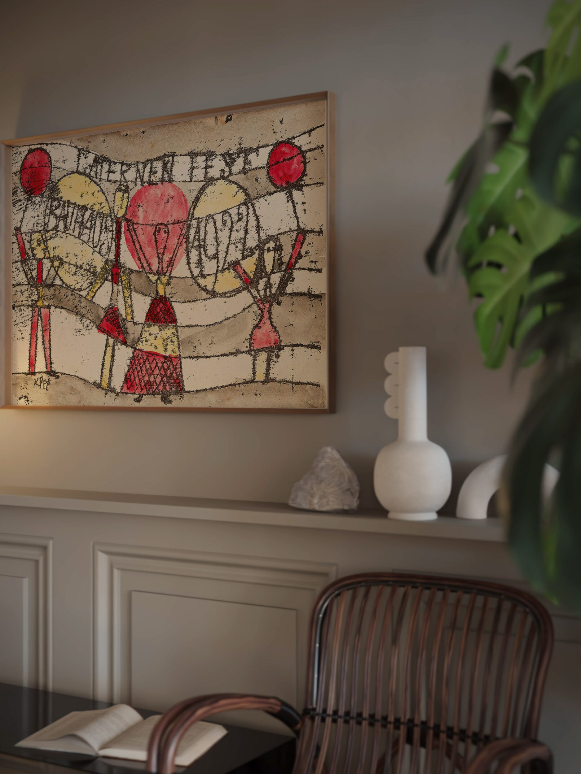
Bauhaus art is often reduced to “circles, triangles, and primary colours”. That is only the surface. The reason Bauhaus-inspired prints still work in homes is deeper: they make a wall feel organised. A good print uses geometry, colour, spacing, and contrast to guide the eye the way good furniture guides movement through a room.
This guide is written for readers who want both context and a useful buying decision. You will learn what the Bauhaus school actually was, which visual cues matter in a print, how to choose colours and sizes for different rooms, and when to pick a single statement piece versus a set of three.
What Bauhaus Really Means
The Bauhaus was a German school of art and design founded by architect Walter Gropius in 1919. Its big idea was not “make everything look abstract”. It was to bring art, craft, materials, and everyday usefulness closer together. The Metropolitan Museum of Art describes its aim as reimagining the material world through the unity of the arts, with students studying materials, colour theory, and formal relationships before entering specialist workshops.
That matters for wall art. A Bauhaus-inspired print should not feel like random decoration. It should feel constructed. The shapes should relate to one another; the colours should have a job; the blank space should be intentional. When those parts work together, the print gives a room rhythm instead of visual noise.
The Five Visual Cues To Look For
Use this quick test before buying
- Geometry: circles, rectangles, arcs, triangles, grids, and diagonals should be easy to identify.
- Balance: the composition should feel stable, even when it is asymmetric.
- Colour logic: look for a limited palette: primary red, yellow, blue and black, or a softer modern palette like terracotta, cream, olive, and brown.
- Negative space: empty areas are part of the design, not wasted space.
- Typography or poster structure: many Bauhaus-inspired prints use clean sans-serif lettering, exhibition-poster layouts, or strong margins.
If a print has ten colours, decorative flourishes, and no clear structure, it may be geometric, but it will not give the same Bauhaus feeling. The style works best when it feels disciplined.
Which Bauhaus Print Fits Your Room?
Start with the room before you start with the artwork. A Bauhaus print changes the pace of a space. It can make a soft room feel sharper, a plain wall feel designed, or a gallery wall feel more intentional.
| Room | Best choice | Why it works |
|---|---|---|
| Living room | One large print or a coordinated set of three | The wall above a sofa usually needs scale and rhythm. A triptych creates structure without needing many unrelated pieces. |
| Bedroom | Warm earth tones, softer curves, lower contrast | Terracotta, cream, beige, and muted green keep the geometry calm enough for a restful space. |
| Home office | High-contrast lines, grids, circles, and black frames | Bauhaus geometry adds energy and focus without becoming a figurative distraction. |
| Hallway | Vertical poster-style prints | A narrow wall benefits from strong composition and clear typographic structure. |
| Dining room | Bold colour blocks or a paired set | Dining rooms can carry stronger colour because the art is usually seen from a distance. |
Colour: Primary Bauhaus Or Warm Modern Bauhaus?
Classic Bauhaus design is often associated with primary red, yellow, blue, black, and white. That palette is powerful, but it is not the only way to bring the idea home. Many modern rooms need a warmer translation: rust, sand, cream, olive, brown, and black. The geometry stays Bauhaus-inspired, while the colour becomes easier to live with.
Choose primary colours if…
- your room is mostly white, black, grey, or very minimal;
- you want the artwork to be the loudest object in the space;
- you are styling a studio, office, creative corner, or modern hallway.
Choose warm earth tones if…
- your room already has wood, linen, rattan, beige, tan, or terracotta;
- you want Bauhaus structure without a hard museum-poster feeling;
- the artwork will sit above a bed, sofa, or dining bench where warmth matters.
Single Print, Pair, Or Set Of Three?
A single Bauhaus print is strongest when you want one focal point: above a desk, above a small console, or beside a reading chair. A pair works well when the wall already has symmetry, such as two lamps or two bedside tables. A set of three is the most useful for wide furniture because three frames naturally stretch across the wall while keeping the same design language.
Simple sizing rule
For art above furniture, aim for the total artwork width to feel visually connected to the furniture below it. Too small looks accidental; too wide can overpower the room. When unsure, choose fewer larger pieces instead of many small ones.
Framing And Placement Details
Bauhaus prints usually look best in simple frames. Thin black frames sharpen strong lines. Natural wood frames make warm earth-tone prints feel softer. White frames can work in bright Scandinavian rooms, but they can disappear on a white wall unless the print has enough contrast.
Hang the print where the eye naturally pauses: above a sofa, headboard, sideboard, desk, or hallway console. If the print has strong diagonals, leave more breathing room around it; diagonals already create movement, so a crowded wall can make the composition feel restless.
Three Bauhaus-Inspired Starting Points
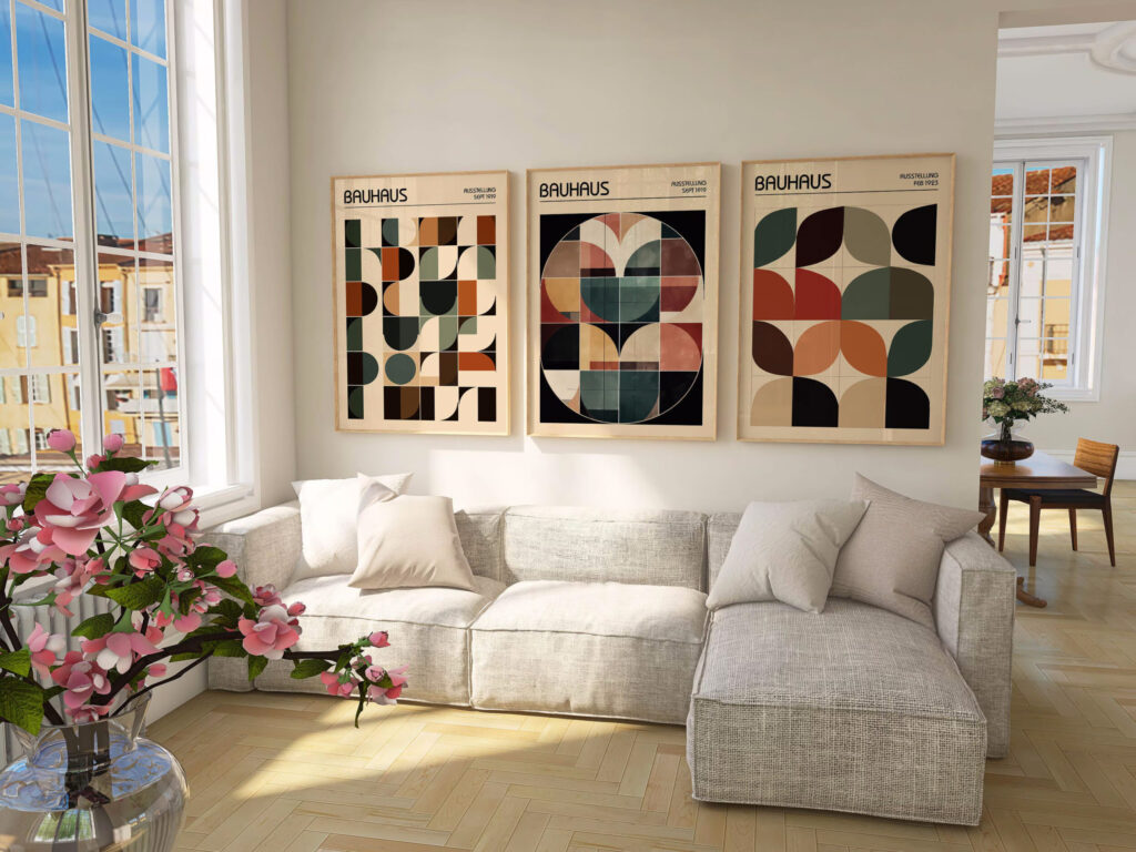
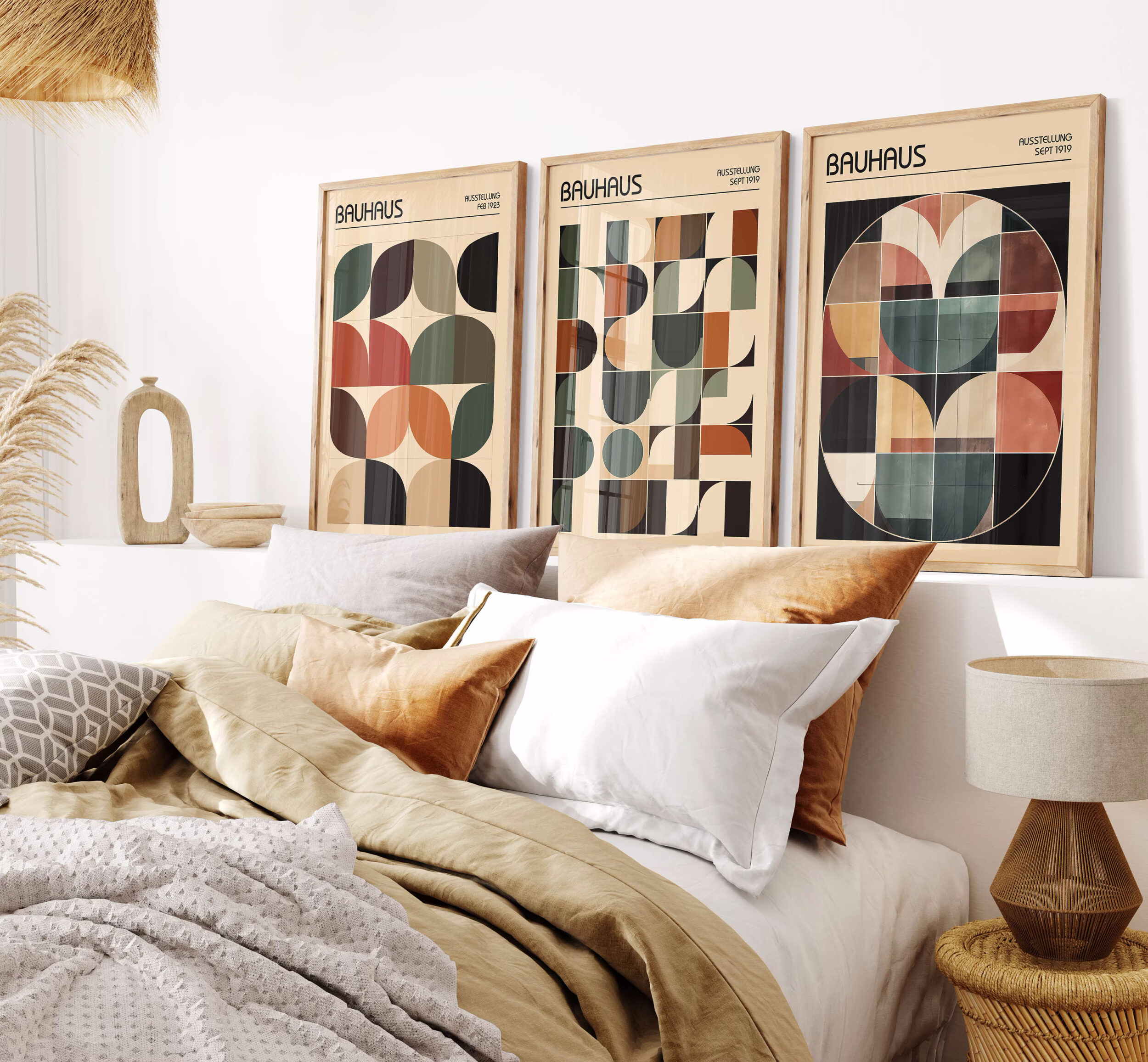
Warm triptych for a living room wall
The Set of 3 Earth Tone Terracotta Bauhaus Prints is the best starting point when you want structure, warmth, and enough scale for a sofa, bed, or hallway.
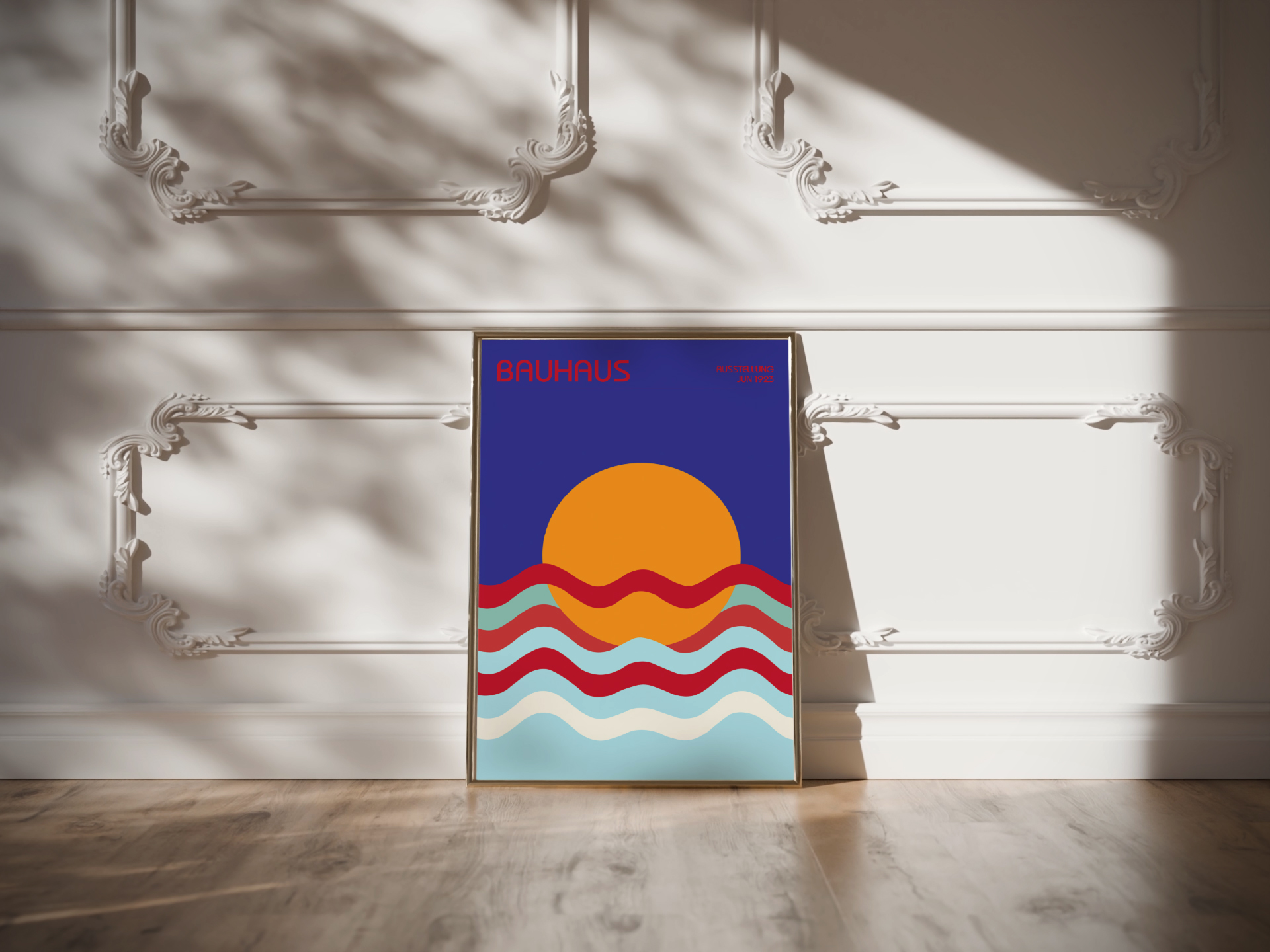
Curves for a coastal-modern room
The Vibrant Bauhaus Style Sun & Waves Art Print keeps the geometry but uses a more relaxed rhythm for brighter, softer rooms.
How To Make Bauhaus Feel Personal
The mistake is treating Bauhaus as a costume for the room. You do not need a fully modernist apartment, chrome furniture, or only primary colours. Use the print as one strong system, then connect it to the room through two or three echoes: a black frame, a terracotta cushion, a round lamp, a gridded rug, or a simple side table.
For a gallery wall, repeat one rule. It can be the same frame colour, one shared accent colour, or one repeated shape such as circles. The more varied the art, the stricter the frame system should be. The stricter the art, the more relaxed the surrounding decor can be.
Quick Buying Checklist
- Does the print have a clear structure? You should be able to describe the composition in one sentence.
- Does the palette match the room temperature? Primary colours for crisp energy; earth tones for warmth.
- Is the scale big enough? Bauhaus prints lose impact when they are too small for the wall.
- Will the frame support the geometry? Choose black for precision, wood for warmth, white for lightness.
- Is the CTA honest? Buy the print because it fits the room and the design language, not because of fake urgency or trend pressure.
Shop Bauhaus-Inspired Prints
Explore geometric wall art, warm triptychs, sun-and-wave compositions, and modernist prints for living rooms, bedrooms, offices, and gallery walls.